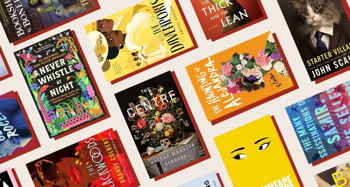
‘Tis the season of all the best of lists, and this is yet another one you can pore over. But instead of focusing on book descriptions, this roundup is all about the best book covers of 2023, so it is a visual treat to enjoy gorgeous art, illustrations, design, and composition. The saying may go that you should not judge a book by its cover, but the reality is we all do it. A book cover tells readers a lot and is often the biggest marketing tool a book has. Highlighting great book covers just makes sense—these covers told compelling stories that went beyond selling the book.
What goes into determining a good book cover is both subjective and objective. It’s subjective in that it’s going to appeal to some readers more than others, especially if those readers have a proclivity for certain aesthetics: illustrated vs. photographic, single images vs. montages, stark covers vs. busy covers, covers which are font driven vs. those which aren’t. It’s also objective: good art is good art, and for books particularly, good art makes a book come off the shelf. It sells the story, and objectively good art both stands out and fits in. Readers who like a certain type of story can use cover art to find their next read, as much as those covers can help elucidate a book’s genre, tone, and mood.
Like in 2022, there’s no predominating cover trend overall this year. You might recall the book blob of 2021, and while certainly bright colors continue to be popular on covers, the blobby figures seem to have stayed in 2021. But even if there is no predominating trend, there have been design trends this year. Minimalism continues to be big, as does a real focus on typography—particularly of the bold, sans serif variety.
There is a common theme among the best covers here, too: compelling faces and expressions. This shouldn’t be surprising, as humans are drawn to just this. We want to see expression, and these covers all deliver in that department, whether they’re photographed or illustrated. Many also include compelling use of florals to obscure or enhance those faces and expressions.
All of the covers below include credit to the design team, as best as finding that information is possible. This is the annual reminder that information should be easily available on author websites, publisher websites, and other ready sources for readers.
The Best Book Covers of 2023

Big Swiss by Jen Beagin, Designed by Jaya Miceli and featuring art by Anna Weyant
You’ve got to love a book with a cover just as bananas as the story inside. From the moment I saw this cover, I thought, “Now that’s a book I simply must read.” The cover art is taken from a painting by Anna Weyant titled “Falling Woman.” But when you see it here, you wonder, is her world turned upside down? Or is she experiencing some kind of pleasure? The answer, in the novel, is both. And more. It’s a completely wild and gripping story about a woman who moves to the Hudson Valley to escape her trauma and takes a job transcribing sessions for a sex and relationship therapist. But her new town is smaller than she realized, and she quickly recognizes the voices of her neighbors from the recordings of them describing their deepest and most illicit secrets.
—Susie Dumond
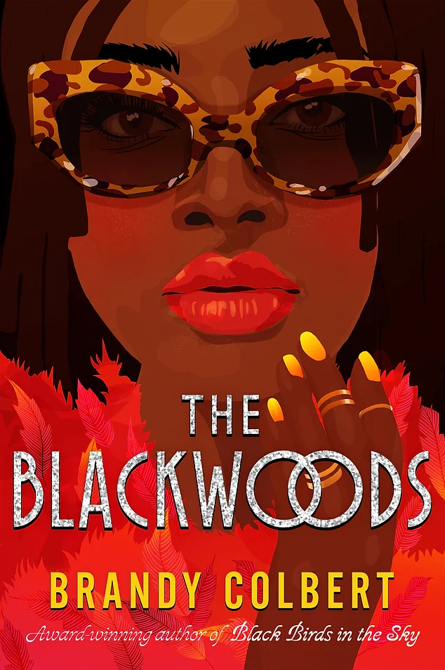
The Blackwoods by Brandy Colbert, Cover illustration by Poppy Magda and Designed by Corina Lupp
I could think of no better cover to represent this story of Black Hollywood legends than this. It is bold in color, with rich glittery accents in gold and silver, and more. It transcends generations—this is a story of a family, and the cover design here does not lean into any particular trend or era, making it truly capture the idea of legacy and timelessness.
— Kelly Jensen
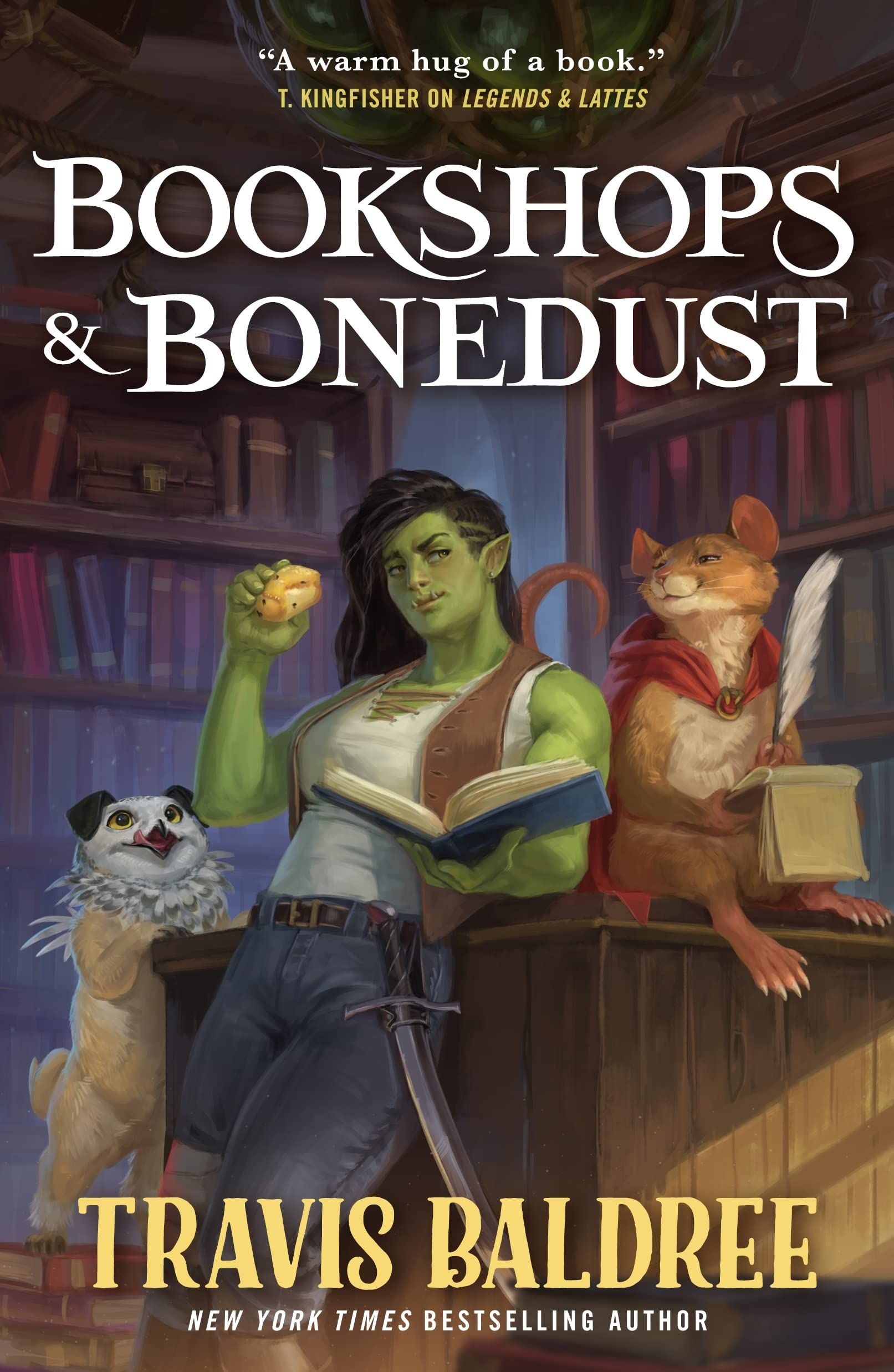
Bookshops & Bonedust by Travis Baldree, Cover art by Carson Daniel Lowmiller
Look, I’m a simple sapphic. I can’t resist the swoon-worthy illustration of buff orc Viv. Plus, she has a baked good in one hand and a book in the other? Literally the dream. Then, of course, there’s the bookstore setting. As if all that wasn’t enough to snag me as a reader, there’s Potroast the gryphet. This cover perfectly represents the cozy queer fantasy inside. I’m so glad we got this prequel to Legends and Lattes. I would read a hundred more in this series, especially if Lowmiller continues to illustrate all the covers.
—Danika Ellis

The Centre by Ayesha Manazir Siddiqi, Cover design by Jonathan Bush, art direction by Evan Gaffney
I was immediately drawn to this book because of the cover. The flowers overwhelm the eye, but the longer you look at the art, the more you notice disturbing little details that really make it stand out: the skull planter, all the open-mawed venus fly traps in the bouquet, the thorny vines creeping around the filing cabinet, and the spilled coffee. The tableau is odd and intriguing, clueing you into the fact that this book contains dark secrets it isn’t going to give up willingly.
(As an aside, the UK cover is so different you wonder how it could possibly represent the same book, and yet also really captures the off-kilter essence of Manazir Siddiqi’s story. That one has a more hypnotic vibe, while the US cover goes full gothic thriller. The differences between the two perfectly capture what makes cover art and design so fascinating to me! Both are well suited to the book but definitely set the reader up to expect something different. It makes you want to read the book even more to find out how both fit, doesn’t it?)
—Rachel Brittain
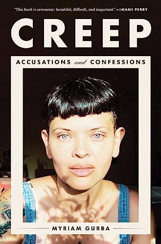
Creep: Accusations and Confessions by Myriam Gurba, design by Clay Smith
I am a huge fan of Myriam Gurba, so when I heard about this blended memoir, nonfic, history book I was fully in. And then I saw the cover, and I couldn’t stop gazing at it the way I would upon discovering a work of art in a gallery. It’s an absolutely gorgeous photograph in composition—especially its use of light and shadow. Just look at the shadow of flowers creeping up her neck and face. The only problem with this cover is how many times I had to tell myself not to go cut my own bangs.
—Jamie Canavés

The Davenports by Krystal Marquis, Design by Theresa Evangelista and art by Deanna Halsall
I love how much this book cover conveys with a seemingly simple design. She’s looking at us, he’s looking at her, which is a dynamic I LOVE. Plus, they are clearly the subject of gossip, which is even more delicious. The yellow palette is sumptuous without being distracting. Lastly, the city skyline, with the historical clothing and title font, set the scene perfectly for this YA historical romance.
—Isabelle Popp
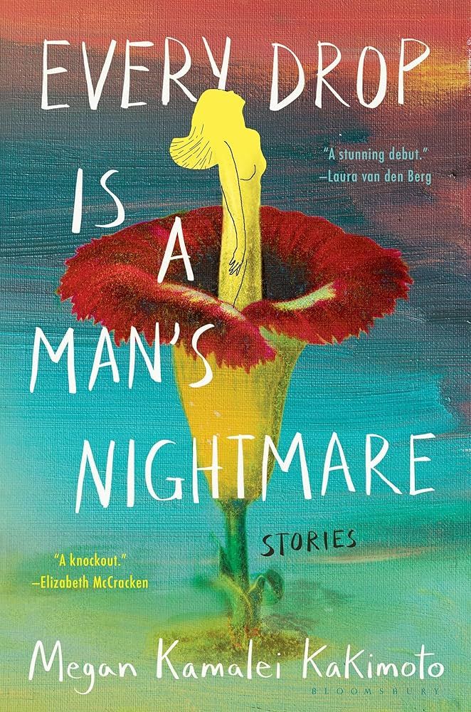
Every Drop is a Man’s Nightmare by Megan Kamalei Kakimoto
I adore the rich, stunning colors and illustration style of this cover. The figure of a woman at the center of a corpse flower is intriguing at first glance, and when you read the short story that inspired it, it hits even harder. These lightly speculative stories about girls and women in Hawaii are immersive and haunting in all the best ways, and they’ll stick with you after reading it just as much as the gorgeous cover.
—Susie Dumond
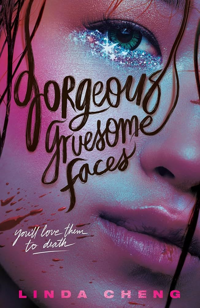
Gorgeous Gruesome Faces by Linda Cheng, Cover by Samira Iravani
This is a book I’ve been looking forward to for a while, and the cover had a big part in that. I still love the fabulous-girls-on-YA-books trend, so my liking this one isn’t surprising. What makes it stand out amidst a sea of fab girlies, though, is that it’s that much more glam (the glitter!), the color palette gives, and you barely just notice the splatter of blood in the bottom left corner. That the words “gorgeous gruesome faces” are spelled out in hair further promises a book full of glittering grotesqueries.
— Erica Ezeifedi
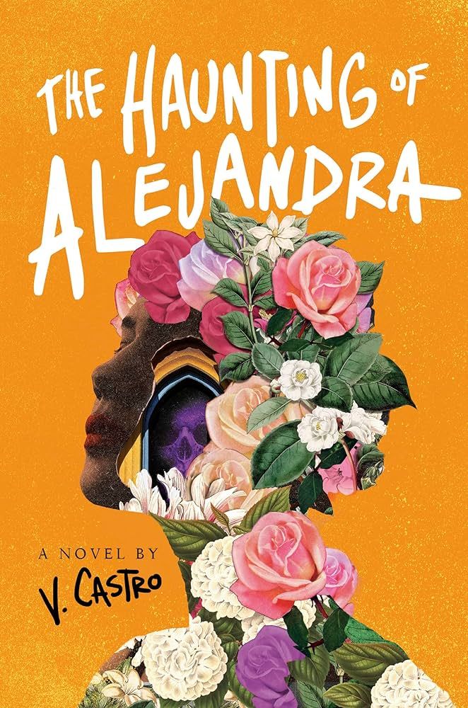
The Haunting of Alejandra by V. Castro, Cover Illustration by Alex Eckman-Law, design by Regina Flath
When I heard V. Castro had written a horror novel about a woman haunted by La Llorona, I expected a cover that would feature the wailing woman in white that I saw in my childhood nightmares. But the team behind this art went in a totally different direction. The beauty is in its stark contrasts: the delicate creams and pinks of the floral silhouette against the bright marigold background, the color of the cempasuchil that is the flower of the dead; the full red lips of the woman’s mostly obscured face, so lush and sensual, next to a ghoulish skull bathed in ominous violet light that you might miss if you don’t look too carefully. It is visually arresting and not at all what I expected in a novel about a woman being driven slowly to madness by the ghostly vision of a ghost from Mexican urban legend, and I love it for that reason. The book itself is fantastic too, and well served by a cover that sneaks dark imagery into a pretty package.
—Vanessa Diaz
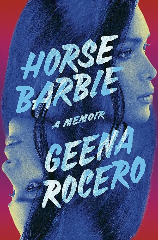
Horse Barbie by Geena Rocero, Cover design by Rachel Ake Kuech, and cover photograph by David Dougan
This book is gorgeous on the inside and out! I absolutely stopped scrolling the first time I saw this cover in a list of 2023 titles and have paused to look at it again and again every time it’s crossed my path since—including every time I opened my audiobook app while listening to it. I love how it’s a gorgeous profile picture of Geena Rocero instead of a standard author cover photo with its Queen of Hearts playing card composition. The colors are both soothing and striking, and the lettering both blends beautifully into the art but also stands out enough to be noticed. It really checks off all the aesthetically pleasing boxes for me as a cover facing out book for a bookshelf.
—Jamie Canavés
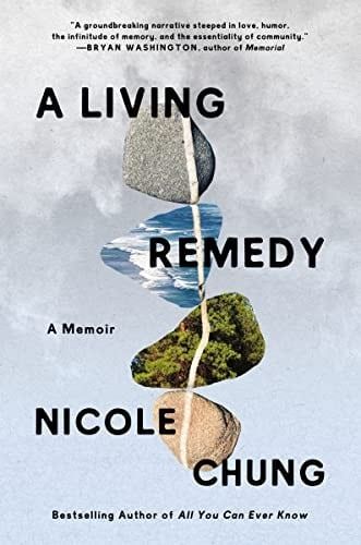
A Living Remedy by Nicole Chung, Cover design by Vivian Lowe
It’s actually hard for me to look at this cover without crying. I read an interview with Vivian Lowe where she mentioned that the book cover feels the same way the book feels, and I could not say it better myself. It’s deceptively simple: four rocks, two that look like rocks and two rock shapes with images of forest and water inside them, are connected by a white line, the kind you find on what I called a “lucky stone” growing up. The design captures all the complexities at the heart of Chung’s gorgeous memoir: that grief and love are deeply, inextricably connected, that the only way through anything is through it.
—Laura Sackton

The Many Assassinations of Samir, the Seller of Dreams by Daniel Nayeri, illustrated by Daniel Miyares
I’m always really impressed with covers that do a lot with a little, especially when it comes to text. This gorgeous watercolor cover is lush and eye-catching. The bold text takes up most of the space, with the illustrations weaving their way between words. The small shadow figures seem to run across the cover, perfectly capturing the constant movement of this story that takes place on the Silk Road. It looks like a high-octane dreamscape, which is exactly how the story feels.
—Rachel Brittain

Never Whistle At Night: An Indigenous Dark Fiction Anthology Edited by Shane Hawk and Theodore C. Van Alst Jr., Cover art by Perry De La Vega
For an anthology of dark fiction, you would not anticipate such a neon, energetic illustration for a book cover. But there’s something absolutely perfect about the pairing of the two. This book pops out on shelves—I almost bought it after already owning it digitally because it stands out and is compelling. It’s slightly otherworldly while also being entirely of this world. I’ve yet to read the collection, but my guess is each of the elements of the cover design has a tie to a story within it. I’m especially drawn to all of the eyeballs, both embodied and not.
—Kelly Jensen

Occulted by Amy Rose, Ryan Estrada, and Jeongmin Lee
This cover has a young girl engrossed in reading a book, unaware of the creepy long-haired figure who is looming behind her and focusing some seriously ominous energy at our young hero’s head. It is the perfect introduction to a fabulous graphic novel that was one of the best books I read in 2023. In it, Amy Rose narrates in a simple way how she resisted and escaped the cult she was raised in and managed to free herself from the group’s emotional and psychological abuse. And I am so glad she did. The world is a better place with her and her story in it. I am also glad that the cover shows a kid reading because Rose rebelled by reading widely and finally recognizing the manipulation that the group’s leader practiced on her and others. I have been thinking about this a lot lately, especially given all the book bans being promoted and supported in the US. Read this and keep resisting, my friends, wherever you are.
—Summer Loomis
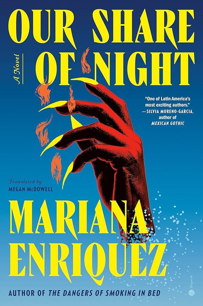
Our Share of Night by Mariana Enríquez, translated by Megan McDowell, Cover design and art by Donna Cheng
This gothic epic tells the story of disappearances and loss in Argentine history while zooming in on a supernatural tale of a man trying to keep his son out of the hands of a cult that worships a dark, violent creature. The cover captures it all perfectly, without falling prey to the allure of gothic grayscale—the bold dark blue and yellow make it unique and eye-catching, paired with the terrifying, curled hand and its sharp claws, the flames emerging from its fingertips. Impossible to miss on a bookshelf, bold, and exciting!
—Leah Rachel von Essen

Raiders of the Lost Heart by Jo Segura, Cover design by Camila Gray
I love the rise in adventure romance, and this cover caught my eye immediately! The art style captures the personalities of the main characters—rival archaeologists Dr. Corrie Mejía and Dr. Ford Matthews—perfectly. The design calls back to classic movie posters like Raiders of the Lost Ark (of course) and Romancing the Stone, which brings in a touch of nostalgia and the promise of adventure. It hints at everything that the story delivers on: humor, suspense, and a love story made all the more compelling by the danger they face together.
—CJ Connor
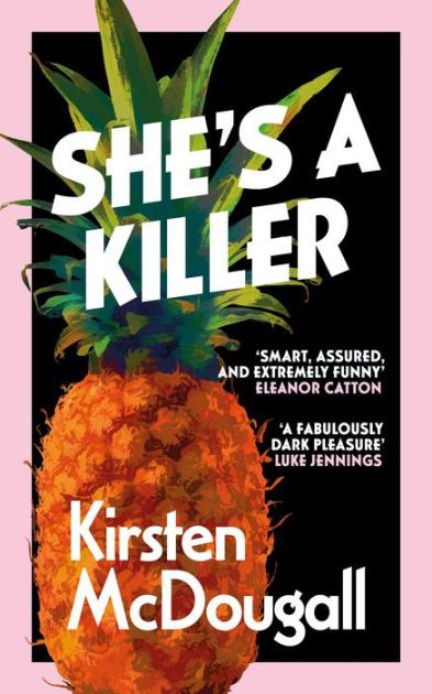
She’s A Killer by Kirsten McDougall, Cover art by Andy Barr
At Gallic Books, our in-house cover designer mocked up a cover for the ARC of one of our big books of the year. There’s a key scene with a pineapple, so he used that image. The cover was so popular on social media and with early readers that we decided to keep it more or less as it was for the final copies of the book. I love how different it is and how intriguing — what does a pineapple have to do with killing? It’s a bonkers book, and the fact that the cover is unexpected and unusual is very on-brand for it.
— Claire Handscombe

Starter Villain by John Scalzi, Cover design by Tristan Elwell
Do I even need to explain why this is the best cover of 2023? It’s a house cat in a business suit! I love serious oil paintings of silly things. There was a restaurant in Portland, Maine, that used to have big oil paintings in gilded frames of video game characters, and they were brilliant. And a painting of a cat in a suit is brilliant! There’s a reason the line to see Grumpy Cat at Book Expo was the longest line they’d had for any event—book people love animals! I 100% bought my own copy after I read it just for the cover, and I will 100% buy any other book that has a cover with a painting of an animal in clothes. Llamas in business casual, lemurs in workout clothes, bears wearing black tie, whatever.
—Liberty Hardy
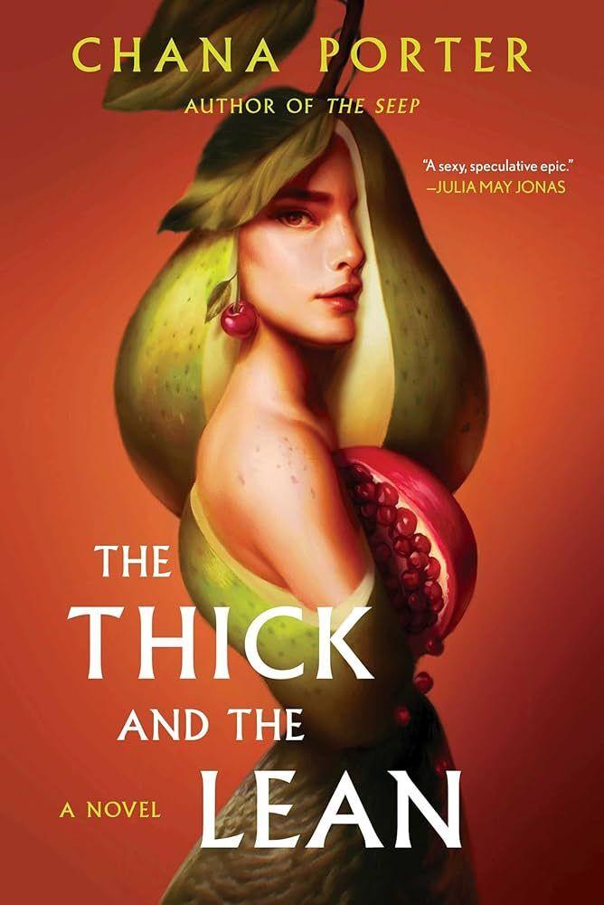
The Thick and the Lean by Chana Porter, Design and Art Direction by John Vairo Jr, Illustration by Aykut Aydogdu
Beatrice and Reiko were born into a world that holds heavy taboos on enjoying food, chewing in public, and staying thin. But Beatrice is drawn towards the sumptuous creations of Earth, and Reiko bucks against the repressive modes of this dystopia. The book cover captures all of this perfectly. A woman cloaked in fruit, with bold pear hair and forbidden-fruit pomegranate curves, cherry earrings, and a wrinkled fig skirt, captures the boldness of the protagonists fighting an oppressive, shaming system that expects them to be thin and pure. Beatrice’s very fullness is radical in a world that valorizes thinness and fasting.
—Leah Rachel von Essen

Us by Sara Soler, translated by Silvia Perea Lambayen. Cover design and illustration by Sara Soler
I thought the cover for this book captured the story perfectly. It’s a graphic memoir about how a couple’s relationship changed and stayed the same after one partner came out as transgender. The gentle pastel color scheme paired with the couple embracing with their heads touching underneath the title radiates the same unconditional love that the author and her wife clearly feel for each other.
—CJ Connor

Yellowface by R. F. Kuang
The striking simplicity of this cover is a huge strength — especially when paired with the bold yellow, which immediately draws the eye to it. I honestly think this cover is genius — it calls attention and announces itself, and it should because it’s a brilliant book. And having just the eyes without any other facial features gives it an edge of creepiness, which is the perfect vibe for this novel.
— Claire Handscombe
Want more of the best book covers? You can dig through past editions of the best book covers for 2022, 2021, 2020, 2019, and 2018.
